Tim Spann, national sales manager UK for Keller Kitchens discusses the benefits.
In the kitchen and wider interiors industry, we both live for and through trends. We follow them, create them and/or ignore them. For example, the one we all hear of now is the cost-of-living crisis, and so we are turning to brighter colours to make us happier. This all feeds into the psychology of colour, and the kitchen can be the ultimate portal for an expression of how we feel or want to be seen.
The palettes that nature provides are always base influences; nature provides us with hues of calming harmony that bring peace and relaxed feelings. Landscapes and nature are major sources of inspiration; through nature we create connection with the outside world. The shades of nature imbue comfort and focus on sustainability. Softer pastel shades of green, blue, nude, cream, greige and natural stained woods and veneers satisfy this feeling
The recently-coined term “Cluttercore” gives rise to a psychology which evokes maximalism and extravagance. This trend is a tribute to all the imperfections that make our spaces and lifestyles unique. Confidence found in this micro-trend nurture creativity to bring compelling, mesmerising and fresh design into the heart of the home.
When the mood takes us back to basics, the style, feel and shades of Hellenismcan deliver a more sensorial design; for example, the use of visually vibrant materials that deliver texture and things we like to touch. The aesthetic forms from ancient Greece convey elegance and grandeur, rich with feminine elements and round shapes with beautiful shades of white, gold, silver and marble predominate.
At a time when we are looking to inject energy into our lives, the urge takes us to mixes of organic and synthetic laced with fun and functionality. Good design can be combined with punchy colours giving scope for freeform that can turn chaos into joy. Dynamic features can include pop art and symbols, kinetic graphics, colourful bold stripes and vibrant checks. Here we are looking at earthy colours, bronze, ochre, browns and azure for that asserted look and feel.
The colours in our kitchen do impact on our mood and feel for our surroundings. It is also thought that colour in the kitchen can even impact our appetite. So let us consider the psychology of individual colours and those all-important choices. And do we just choose the colours we like? Well . . . probably not. The colours we choose can impact in different ways.
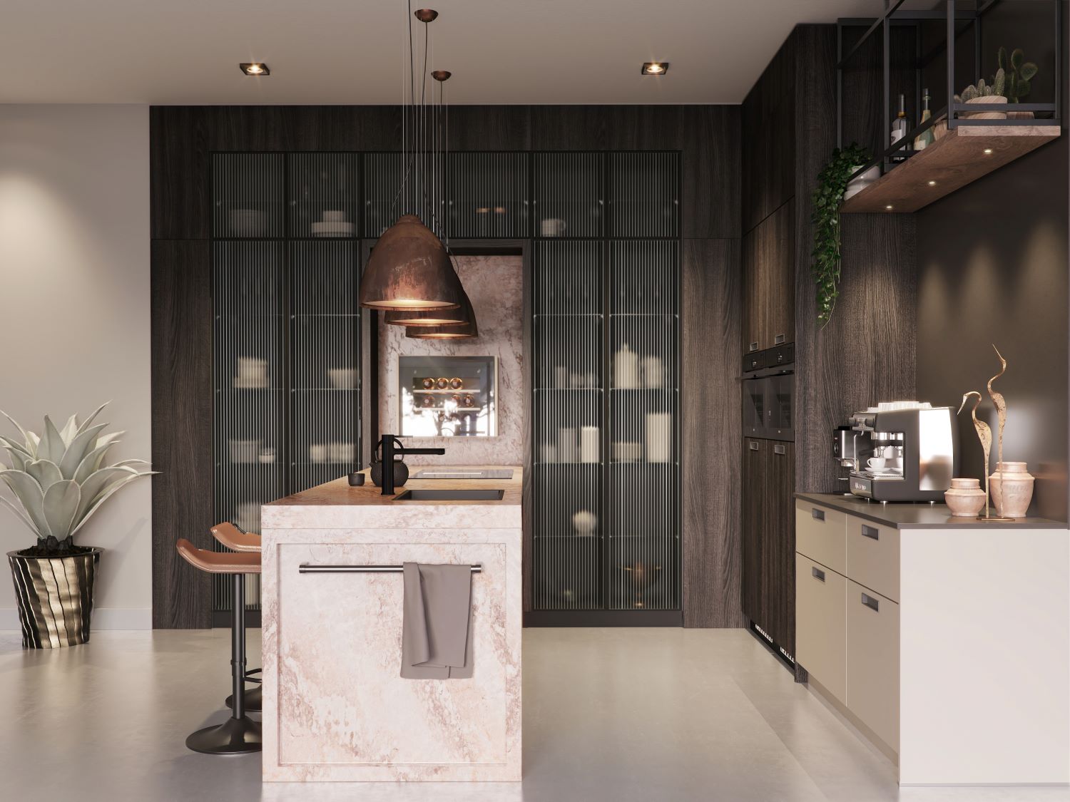
Pictured is the Urban Nude kitchen from Keller.
Red – it is said that red can increase a person’s appetite. Ever wondered why so many restaurants have red tablecloths? It gives higher energy levels and is associated with passion. Seeing red really does get the heart racing, so don’t go for a full room of red.
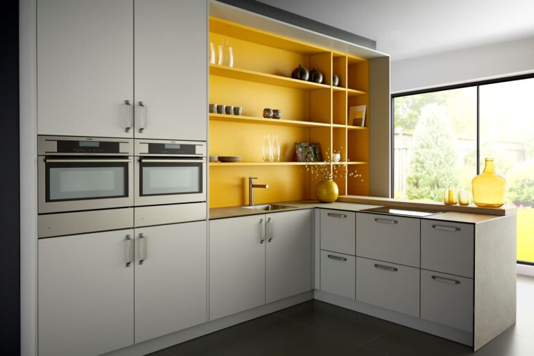
Yellow – is the colour of the optimist that promotes happiness which also improves appetite so studies have shown.
Blue – is one of the more relaxing colours giving feeling of space and confidence and reminds us of the sky and the sea.
Green – is the calming colour of nature itself and can invoke good digestion; it’s also been known to suppress appetites. Various shades of green can bring an inviting and refreshing living space; think fresh, healthy, plants, and nature which all invoke harmony and balance.
White and grey – project an air of confidence, class and success, along with maturity and security. Using these colours will make the kitchen feel clean and open but be aware that all white with no highlights will leave the heart of the home feeling too sterile.
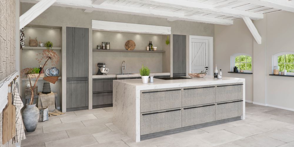
Pictured is the New Country kitchen from Keller.
With aspects of open living and omni-plan, the colour choices for a new kitchen feed into all areas of interior design for the home more readily these days. With this in mind, mix and match and be daring. Natural light or artificial light will be key in how colour choices are viewed. Different colours are reflected in different ways from different materials in different lighting conditions. Good lighting or good light are essential. Bright and strong colours can help breathe life into the kitchen space where natural light is limited; but neutral colours do stand the test of time.
When steering towards a more neutral colour scheme, personality colour-pops can be introduced through accessorising with the smaller items around the kitchen, or go for a feature wall or splash-back.
TIP – always take colour swatches and consider different choices in the space. The way that different lighting reflects colour can make a tone appear completely different.
Keller is well known for offering the widest range of colours (2,050 NCS) and finishes in the kitchen furniture market – along with a vast range of cabinet options, all produced by the most sustainable means possible. In addition, the company is proud to be a Carbon Neutral kitchen manufacturer since 2017 and is now on the way to becoming Carbon Negative.
For further information, please visit www.kellerkitchens.com.

