
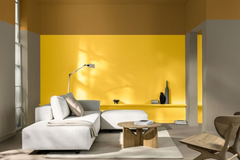
Dulux is encouraging architects, specifiers, and designers to embrace yellow and bring a sense of optimism, pride, and imagination to projects. With this in mind, the paint manufacturer has named True Joy™ as its Colour of the Year for 2025, supported by three adaptable ColourFutures™ palettes.
For over two decades, the Dulux Colour of the Year has been selected through trend research by Dulux’s colour experts and international design professionals. True Joy™ for 2025 is a vibrant and uplifting yellow, reflecting a desire to break free, reset, and innovate. Dulux also encourages designers to spread the joy of yellow, helping clients step out of their comfort zones and feel confident.
Yellow hues, like True Joy™, can be used as bold statement colours or as accents. To assist designers in advising clients on ideal colour pairings, Dulux has developed three supporting ColourFutures™ palettes:
- Bold Colour Story: Inspired by the excitement of adventure, these bold hues inject spontaneity and energy into any space. Bright blues and oranges contrast beautifully with accent yellow, making them perfect for educational and office environments where inspiration and creativity are paramount.
- Human Colour Story: Celebrating artisanal craftsmanship, these shades of wood and clay reflect the natural materials used in handmade processes. Ideal for educational and healthcare spaces, these colours bring warmth and authenticity.
- Proud Colour Story: Drawing from diverse global cultures, these rich, earthy browns and greens celebrate the heritages that make us unique. These colours are well-suited for hospitality and residential environments, creating a welcoming, homely atmosphere.
Dawn Scott, Dulux trade senior colour designer, said: “True Joy™ and its complementary palettes offer a fresh perspective on how colour shapes our built environments. These colours aren’t just trends; they are tools for architects and specifiers to create spaces that reflect their clients’ values and visions, enhancing our experience of the spaces we live in.
“One of the most powerful applications of True Joy™ is within healthcare settings. When paired with the earthy, natural tones of the Human Colour Story, it can transform waiting rooms, corridors, and communal areas into uplifting and calming spaces. This combination brightens the atmosphere while connecting patients and staff to warmth, creativity, and well-being.”


