Franke, best known as a leader of solutions for residential kitchens, professional system catering and professional coffee preparation is launching its future look and brand identity. Since September 13, 2022, Franke has been rolling out this new appearance on its website and across all communication touchpoints.
“Change is the only constant in life.” For Franke, the brand philosophy means intelligently seeking out new ways to face constant change – together with customers and partners. To achieve this, the company marries its extensive engineering expertise with state-of-the-art technology and functional aesthetics, as well as integrated services and innovative solutions. In short: “Franke transforms change into opportunities for a better living.”
Where traditional meets forward-thinking
In order to steadfastly pursue this brand purpose through all areas of the company, Franke developed a brand identity that, from September 13, will be gradually visible on all platforms, such as the updated website, and in all marketing communication. The role of design here is to express this newly developed brand positioning by means of a visual identity.
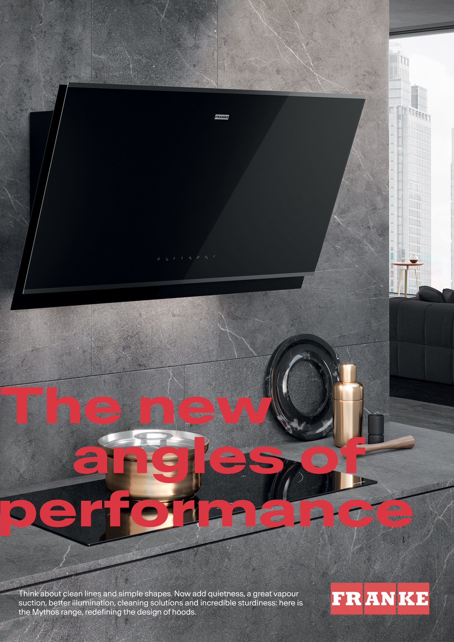
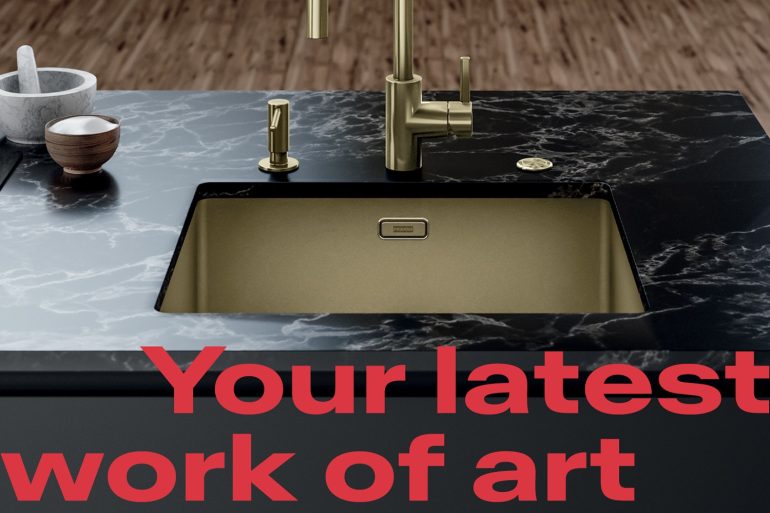
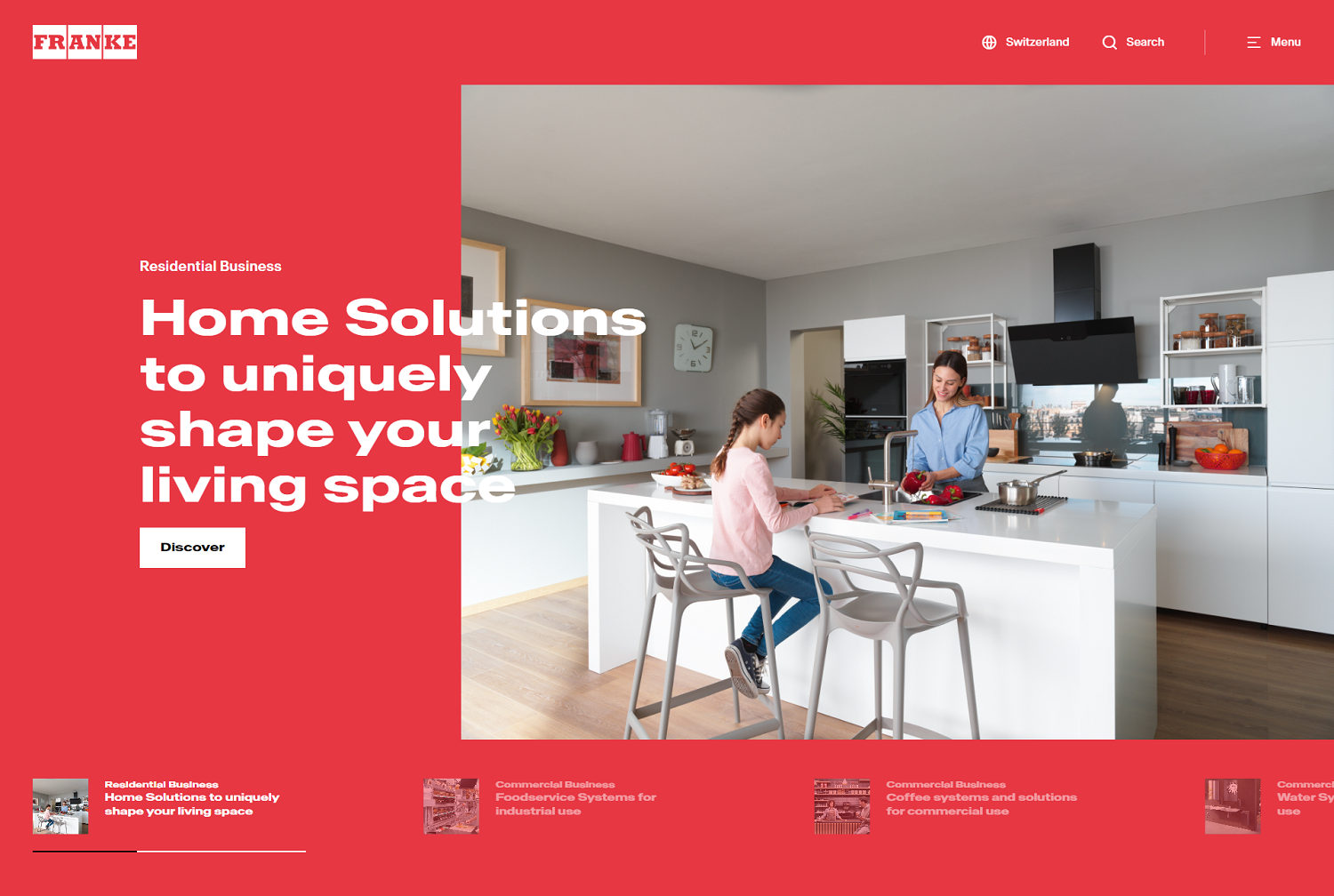
Remaining true to the principle “reassured and excited”, the future design is dynamic, flexible and contemporary, boasting fresh colors, clean lines and clear symbols. Whilst evoking memories of its predecessor, the updated Franke logo appears in a bold “Vibrant Red” tone, an evolution of the current brand color – for greater precision and adaptability.
Especially striking is the flexible layout with the new, dynamic “Antarctica” font that breaks through the boundaries of the formats and is therefore highly effective at conveying the message of constant change. It also allows for a variety of combinations of design elements that can be subtle or bold, precise or dynamic, elegant or emotional – depending on the communication channel in question.
The new website: Breathing new life into the Franke touchpoint
Following more than six months of development, one of Franke’s most important channels – the company website, franke.com – is making its debut appearance in the new design, adding weight to the brand positioning. Thanks to its responsive design, the clear and readable display is optimized for use on a variety of end devices. Furthermore, the clear information architecture and attractive content is intended to improve user experience. On the redesigned website, users can find extensive information on the Franke Group and the three divisions, as well as all the documents and information they might need relating to products and services.
“The new branding is more than just an updated look for the Franke Group: We relish change and see it as an opportunity to innovate and to keep improving. That’s why we refined our brand positioning and why we’re open to change. We boldly push the boundaries and drive forward innovations, so that we are always one step ahead. Day in, day out, we strive to present the best possible ideas and solutions to respond to our customers’ ever-changing needs. Our new design is a clear expression of this ambition,” explains Patrik Wohlhauser, CEO of the Franke Group, excitedly.
