Mereway’s new look brochures created to reflect quality & beauty
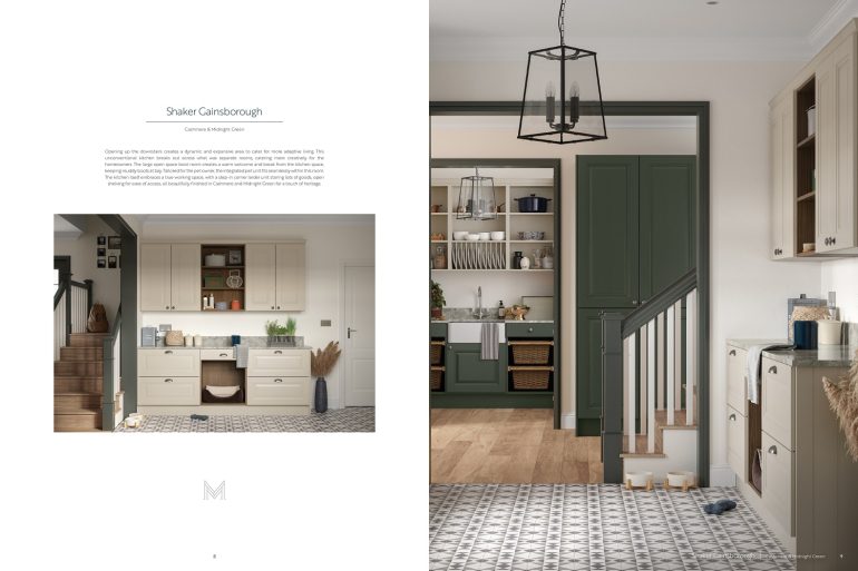
As part of the new Mereway Kitchens visual identity and rebrand, the UK company has invested in new consumer brochures which reflect the brand’s values of beauty, craftsmanship and elegant design.
The collections have been curated into two new stunning coffee-table brochures – Mereway Kitchens (122 pages) and Mereway In-Frame (82 pages), designed to make the selection process more experiential for
consumers and showcasing Mereway’s designs easier for retailers.
The larger Mereway brochure combines contemporary and modern classics, as both real homes and promotional examples. The modern Q-Line collection sits alongside traditional woodgrain Shakers, with plenty to inspire – including concepts that rip up the rule book, blending a handleless, super-contemporary kitchen with a skinny shaker door, colours which complement and clash pushing the boundaries of design.
In-Frame Kitchens highlights the brand’s premium range which can be personalised with a carefully selected colour palette of hand-painted finishes to create a timeless design
